One of the most transformative aspects of building a successful capsule wardrobe lies in mastering color coordination. While the allure of vibrant hues and bold patterns can be tempting, a thoughtfully curated neutral palette creates exponentially more outfit combinations from fewer pieces. This minimalist approach to color doesn't mean sacrificing personal expression—rather, it establishes a versatile foundation that allows for strategic pops of color while ensuring every item in your closet works harmoniously with the others.
Understanding color theory and how different shades interact transforms the daily challenge of getting dressed into an effortless process. When your wardrobe operates within a cohesive color scheme, you eliminate the frustration of pieces that don't coordinate, reduce decision fatigue, and create a signature aesthetic that becomes unmistakably yours. This guide explores how to select, combine, and accent a neutral color palette that maximizes versatility while reflecting your personal style.
The Power of a Neutral Foundation
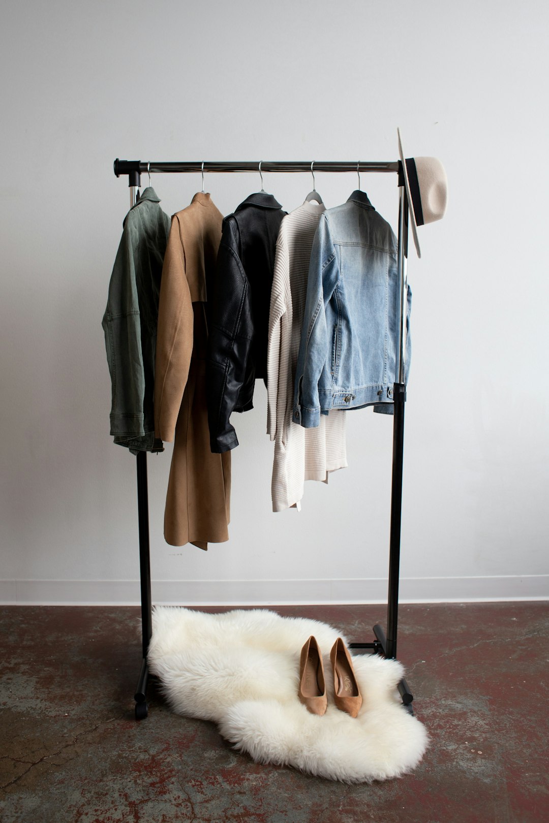
Neutral colors form the backbone of effective capsule wardrobes because they mix and match effortlessly, creating countless combinations from limited pieces. Unlike bold colors that demand specific pairings, neutrals cooperate with virtually everything, including each other. This interoperability is what allows a 30-piece capsule wardrobe to generate hundreds of different outfits.
The classic neutral palette includes black, white, gray, navy, beige, and brown. Each brings distinct characteristics to your wardrobe. Black offers sophistication and formality, creating sharp, polished looks while slimming silhouettes visually. White provides fresh contrast and works across seasons, though it requires more maintenance. Gray bridges warm and cool tones beautifully, offering versatility that works in both professional and casual contexts.
Navy serves as a softer alternative to black, bringing depth without excessive formality. It flatters most skin tones and coordinates beautifully with both warm and cool colors. Beige, camel, and tan introduce warmth to neutral wardrobes, creating approachable, relaxed aesthetics perfect for casual pieces. Brown, from chocolate to cognac, adds richness and pairs exceptionally well with other warm neutrals.
The key to successful neutral dressing lies not in using all these colors equally but in selecting a core palette of three to four neutrals that work for your lifestyle, climate, and personal coloring. This focused approach prevents the neutral palette from feeling bland while maintaining maximum versatility.
Determining Your Personal Neutral Palette
Not all neutral colors work equally well for everyone. Your optimal neutral palette depends on your natural coloring, lifestyle needs, and aesthetic preferences. Understanding these factors helps you invest in pieces you'll actually wear rather than accumulating items that languish in your closet.
Begin by assessing your natural coloring—skin tone, hair color, and eye color all influence which neutrals appear most harmonious on you. Those with cool undertones (pink, red, or blue undertones in skin) typically look best in true white, black, gray, and cool navy. These colors create crisp contrast that enhances cool coloring.
Warm undertones (yellow, peach, or golden undertones) harmonize beautifully with cream, camel, warm brown, and olive. These earthy neutrals complement rather than clash with warm natural coloring. If you're uncertain about your undertones, examine the veins on your inner wrist—blue or purple suggests cool undertones, while green indicates warm undertones.
Consider your lifestyle when selecting neutrals. Urban professionals might prioritize black, gray, and navy for their polished, business-appropriate aesthetic. Those in creative fields or warm climates might prefer beige, cream, and warm browns for their approachable, relaxed feeling. Your environment matters too—city life often involves more black and gray, while suburban or rural settings might lean toward warmer neutrals.
Your existing wardrobe provides clues about your natural preferences. Which neutrals do you already wear most frequently? Which pieces do you reach for repeatedly? These patterns indicate colors that make you feel comfortable and confident—important factors in building a capsule wardrobe you'll actually use.
Creating Depth with Tonal Dressing
Tonal dressing—wearing different shades of the same color family—creates sophisticated, cohesive outfits while adding visual interest to neutral palettes. This technique allows you to play with texture and proportion without introducing additional colors, resulting in elegant, pulled-together looks.
A tonal outfit might combine charcoal trousers with a medium gray sweater and light gray coat. The variation in shades creates dimension and prevents the monotone look from appearing flat. Similarly, mixing cream, beige, and camel produces warm, inviting outfits perfect for casual settings.
The success of tonal dressing relies on incorporating different textures and finishes within your chosen color family. Pairing matte and glossy finishes, smooth and textured fabrics, or structured and flowing silhouettes adds complexity that prevents tonal outfits from reading as boring or one-dimensional.
When building tonal outfits, aim for at least three slightly different shades within the color family. This variation creates enough contrast to define separate pieces while maintaining cohesion. Too little variation appears accidental rather than intentional, while too much disrupts the tonal harmony.
Accessories play a crucial role in tonal dressing. Shoes, bags, and belts in complementary shades complete the monochromatic effect. However, introducing one contrasting element—perhaps a watch or simple jewelry—can add just enough visual break to keep tonal outfits from feeling overwhelming.
The Strategic Use of Accent Colors
While neutral foundations provide versatility, strategic accent colors prevent your wardrobe from feeling monotonous and allow personal style expression. The key lies in selecting one or two accent colors that work harmoniously with your neutral base while reflecting your aesthetic preferences.
When choosing accent colors, consider colors you're naturally drawn to and that complement your personal coloring. These accents needn't be bold or bright—even muted accent colors like sage green, dusty rose, or soft blue add personality while maintaining the sophisticated, cohesive aesthetic of neutral-based wardrobes.
Limit yourself to one or two accent colors maximum. This restraint ensures your accent pieces coordinate with each other and your neutrals. If you choose navy and white as neutrals, you might select burgundy and forest green as accents. These deeper, muted tones add richness without clashing or overwhelming your neutral foundation.
Introduce accent colors primarily through smaller pieces and accessories initially. Scarves, bags, shoes, and jewelry in your chosen accent colors allow experimentation without significant investment. Once you've confirmed these colors work in your wardrobe, expand to accent pieces like sweaters, blouses, or lightweight jackets.
Consider seasonal accent colors if you live in an area with distinct seasons. Deeper, richer accent colors like burgundy, forest green, and burnt orange work beautifully in fall and winter. Lighter, brighter accents like coral, soft yellow, or sky blue complement spring and summer neutrals. This approach allows seasonal variety while maintaining overall wardrobe cohesion.
Color Blocking and Contrast Techniques
Color blocking—pairing solid blocks of contrasting colors—creates visual interest within neutral wardrobes. This technique works particularly well when transitioning between seasons or adding definition to simple silhouettes.
The most straightforward color blocking combines two neutrals in high contrast: black and white, navy and cream, or charcoal and light gray. These combinations create crisp, polished looks appropriate for professional and formal settings. The stark contrast naturally draws the eye and creates visual interest without requiring bold colors or patterns.
For more subtle color blocking, combine neutrals with less dramatic contrast: navy and gray, black and charcoal, or cream and camel. These combinations maintain the color-blocking effect while creating softer, more approachable aesthetics suitable for casual settings.
When color blocking with your accent colors, use the 60-30-10 rule: 60% dominant neutral, 30% secondary neutral or accent color, and 10% accent detail. This proportion prevents any single color from overwhelming while creating balanced, intentional-looking outfits. For example, charcoal trousers (60%) with a burgundy sweater (30%) and cream collar peeking through (10%) demonstrates this principle effectively.
Accessories can color block too. A neutral outfit gains immediate impact from a bold accent bag or shoes. This approach allows you to experiment with color without committing to large colored garments, offering flexibility as your preferences evolve.
Pattern and Print Integration
Patterns and prints might seem contrary to minimalist color coordination, but strategic integration adds personality without sacrificing versatility. The key lies in selecting patterns that incorporate your core neutrals and accent colors.
Stripes represent the most versatile pattern for capsule wardrobes. Classic Breton stripes in navy and white, black and white, or gray and white work seamlessly with solid neutrals. Vertical stripes elongate silhouettes, while horizontal stripes add visual interest to simple pieces.
Subtle plaids and checks in neutral color combinations add texture and visual interest without overwhelming. A navy and gray plaid blazer or brown and cream checked scarf introduces pattern while maintaining color cohesion. Ensure patterns use colors already present in your palette for maximum compatibility.
Small-scale geometric prints in neutral colorways offer contemporary alternatives to solid pieces. Tiny dots, minimal abstracts, or understated geometric patterns add personality while reading as near-solids from a distance. These pieces function almost as flexibly as true neutrals while preventing wardrobe monotony.
When wearing patterns, balance them with solid pieces. A patterned top pairs best with solid bottoms and vice versa. This approach prevents visual chaos and allows the pattern to serve as the outfit's focal point. Mixing multiple patterns requires advanced skill and often works against the streamlined aesthetic most capsule wardrobes aim to achieve.
Seasonal Color Adaptations
While your core neutral palette remains consistent year-round, subtle seasonal adaptations keep your wardrobe feeling fresh and appropriate for changing weather and light conditions.
Spring and summer naturally gravitate toward lighter neutrals. Cream, white, light gray, and soft beige feel seasonally appropriate while maintaining versatility. These lighter tones reflect heat, keeping you cooler in warm weather while creating fresh, clean aesthetics that align with spring and summer's natural lightness.
Fall and winter welcome deeper, richer neutrals. Charcoal, chocolate brown, black, and deep navy provide visual weight appropriate for cooler months. These darker tones also show less dirt and weather wear—a practical consideration during wet, muddy seasons.
Transitional seasons benefit from mid-tone neutrals that work across temperature ranges. Medium gray, taupe, olive, and navy function beautifully during spring and fall, bridging the gap between seasonal extremes.
Your accent colors can shift seasonally while your neutral foundation remains constant. This approach allows wardrobe refreshment without complete overhaul. Spring might introduce soft coral or sage green accents, while fall brings burgundy or forest green. Because these accents work with the same neutral base, they integrate seamlessly despite seasonal rotation.
Building Color Confidence
Many people default to all-neutral dressing not from preference but from fear of getting color combinations wrong. Building color confidence allows you to use your palette more adventurously while maintaining cohesion.
Start by experimenting with color in low-stakes situations. Weekend errands or casual social events provide perfect opportunities to try new color combinations without professional or formal pressure. Pay attention to which combinations make you feel confident and which feel uncomfortable—your instincts provide valuable guidance.
Take inspiration from cohesive sources like fashion editorials, curated Instagram accounts, or even nature. Notice which color combinations appear repeatedly in sources you find aesthetically pleasing. These patterns reveal your natural color preferences even if you haven't consciously identified them.
Create a color board using fabric swatches, paint chips, or photos of items in your chosen palette. This visual reference helps you evaluate potential purchases against your established colors, preventing impulse buys that won't integrate with your existing wardrobe.
Remember that color rules serve as guidelines rather than absolutes. While certain combinations traditionally pair better than others, personal style involves making these principles work for your unique preferences and needs. If an unconventional color combination makes you feel confident and expresses your aesthetic, it's worth incorporating regardless of traditional "rules."
Maintaining Color Cohesion While Shopping
Once you've established your color palette, maintaining discipline while shopping ensures new additions integrate seamlessly rather than introducing incompatible colors that disrupt your wardrobe cohesion.
Before purchasing any new item, mentally inventory your existing pieces and identify at least three items the new piece would coordinate with. This exercise ensures you're adding to your wardrobe's versatility rather than creating isolated pieces that require special accompaniments.
Take photos of your current wardrobe or create a digital capsule wardrobe using apps designed for this purpose. Having visual reference while shopping prevents you from purchasing duplicate shades or colors that seem appealing in-store but don't actually work with your existing pieces.
Be especially cautious with "almost" colors—shades that nearly match your existing palette but differ just enough to clash. Two similar but not identical navy blues or three slightly different grays create unnecessary complexity. When in doubt, choose items that match existing pieces exactly or differ dramatically enough to clearly read as separate colors.
Resist trendy colors that don't align with your established palette, no matter how appealing they seem in the moment. Trend-driven purchases typically see minimal wear because they don't integrate with your wardrobe foundation. If a trending color truly appeals to you, introduce it through an inexpensive accessory rather than committing to a significant garment.
Conclusion: Simplicity Through Intention
Minimalist color coordination transforms capsule wardrobe building from overwhelming to empowering. By establishing a core neutral palette, incorporating strategic accent colors, and understanding how to combine these elements effectively, you create a wardrobe where everything works together harmoniously. This cohesion eliminates daily outfit frustration while creating a signature aesthetic that becomes distinctly yours.
The beauty of this approach lies in its flexibility. Your color palette can evolve as your preferences change, your lifestyle shifts, or you gain confidence in color use. The fundamental principles—neutral foundation, limited accent colors, intentional combinations—remain constant while allowing personal interpretation and growth.
Remember that successful color coordination serves your life rather than restricting it. The goal isn't achieving some abstract ideal of minimalist perfection but creating a wardrobe that functions beautifully for your specific needs while bringing daily joy. When your clothes work together effortlessly and you feel confident in everything you wear, you've achieved true minimalist color mastery.